

Context
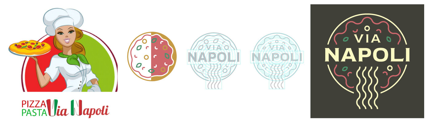
In January 2021, Vía Napoli opened its doors in Ferrol, Galicia. This project aimed to capture the essence of authentic Neapolitan cuisine in its visual identity, including logo, color palette, and packaging, to deliver an elegant and engaging customer experience.
Problem
- Branding was needed to reflect both Italian quality and the welcoming atmosphere of the restaurant.
- The previous graphic elements did not clearly communicate Neapolitan tradition.
- There was a lack of visual coherence across logo, packaging, signage, and communication.
Process
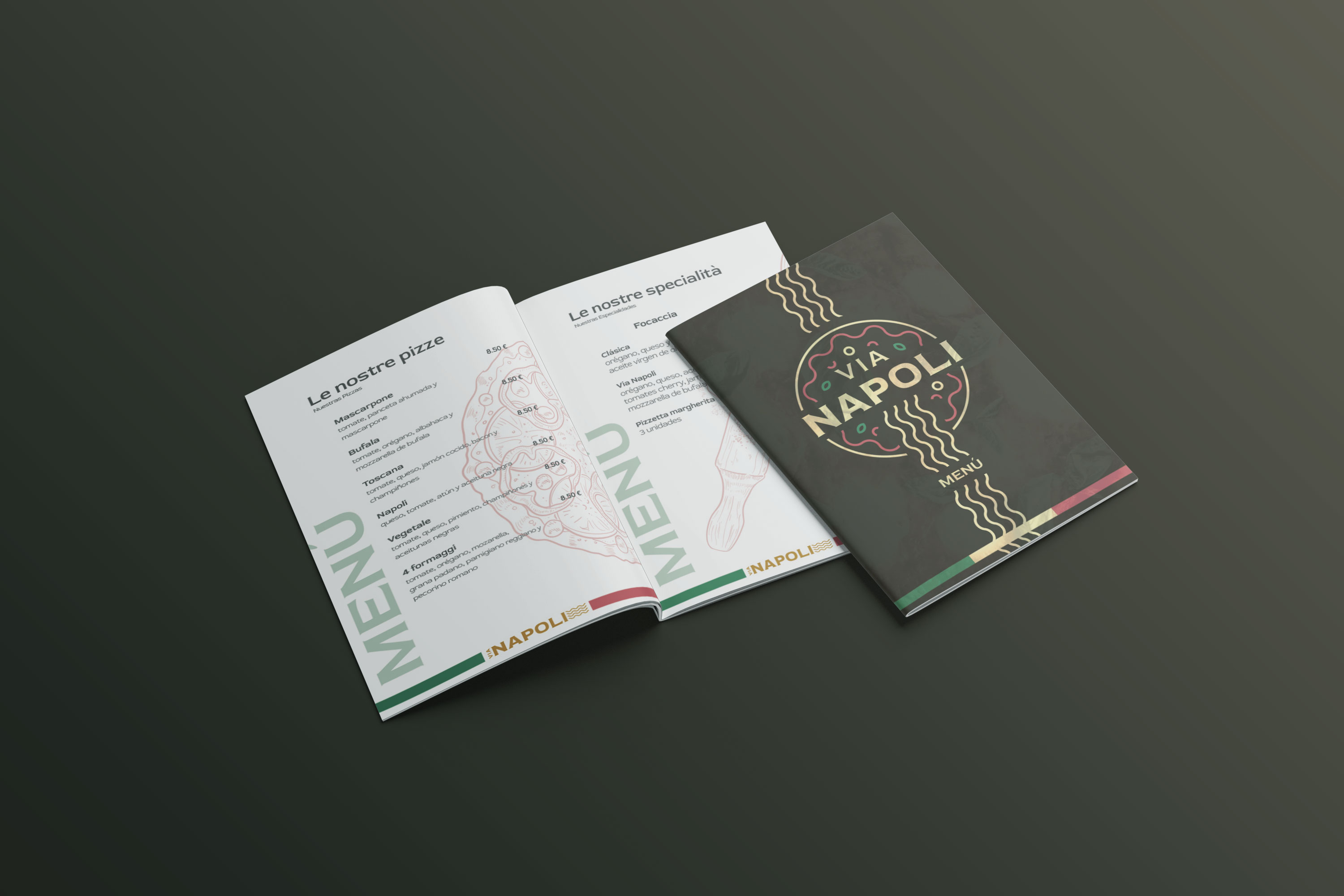
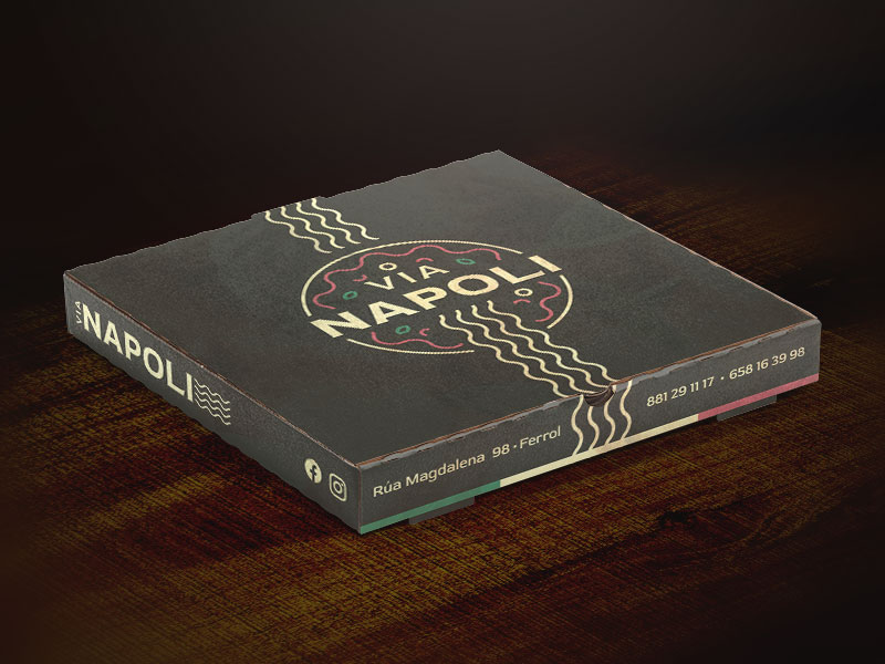
Visual identity design
- Creation of a logo with linear graphic abstraction of main dishes like pizza and pasta.
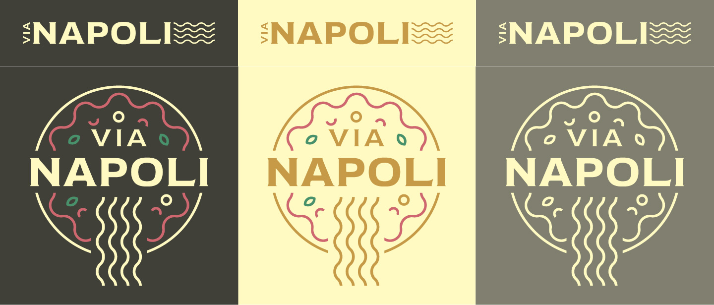
- Palette inspired by the Italian flag (green, white, red) combined with dark backgrounds for elegance and contrast.
- Clean and modern typography to complement the logo.

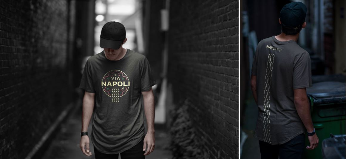
Applications and packaging
- Designed menus, labels, packaging, and other branded materials.
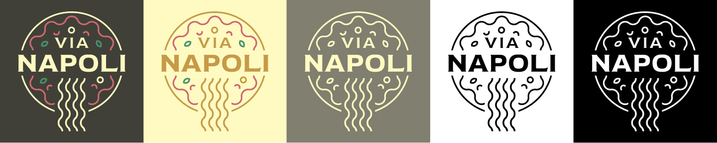
- Adaptation of logo variations for different digital and physical formats.
- Use of dark backgrounds to reinforce sophistication.
Reflection
- It was a challenge to combine Italian tradition with contemporary design.
- I learned how to use national colors in an elegant way without falling into clichés.
- Important to ensure readability and consistency across multiple formats.
See the full project on Behance: Branding Redesign Vía Napoli