
Context
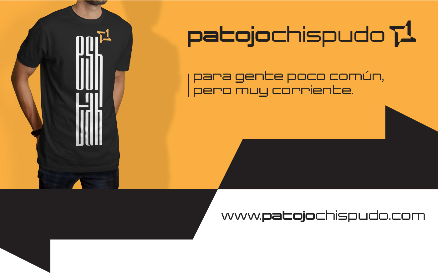
Patojo Chispudo is a clothing brand that emerges from Guatemalan culture, aimed at young people who feel different, creative, and full of spark. The name combines “patojo” (youth) and “chispudo” (clever / full of spark), with a visual aesthetic that seeks to reflect joy, authenticity, and originality.
Problem
- The brand needed a visual identity that captured its unique spirit: informal, vibrant, and diverse.
- There was a lack of coherence in graphic elements, typography, and colors to stand out in the youth apparel market.
- The goal was a brand that felt local, honoring Guatemalan cultural elements, while remaining fresh and visually competitive.
Process
Research & Strategy
- Study of youth clothing brands in Guatemala and Latin America.
- Exploration of cultural symbols, nature, and organic forms.
- Selection of bright, contrasting colors to convey dynamism.
- Modern, casual typography with personality.
Visual Solution
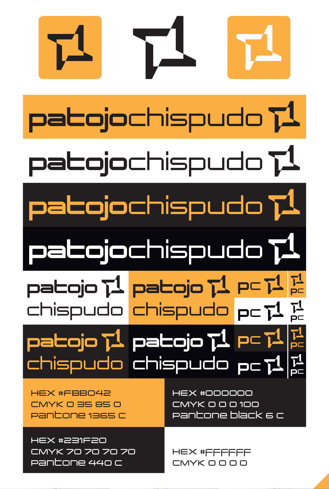
- Logo with bold, informal typography.
- Graphic elements referencing cultural patterns and Guatemalan nature.
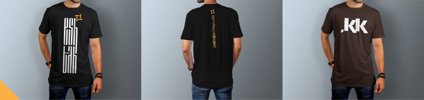
- Applications on t-shirts, labels, packaging, and mockups showing versatile usage.
- Use of contrasting colors to achieve visual impact.
Reflection
- Learned to balance cultural representation with commercial appeal: local identity without clichés.
- Color and typography were key in building brand personality.
- Main challenge: ensuring legibility and consistency across formats (from small tags to large prints).
See more mockups and the full project philosophy on Behance: Branding Patojo Chispudo