
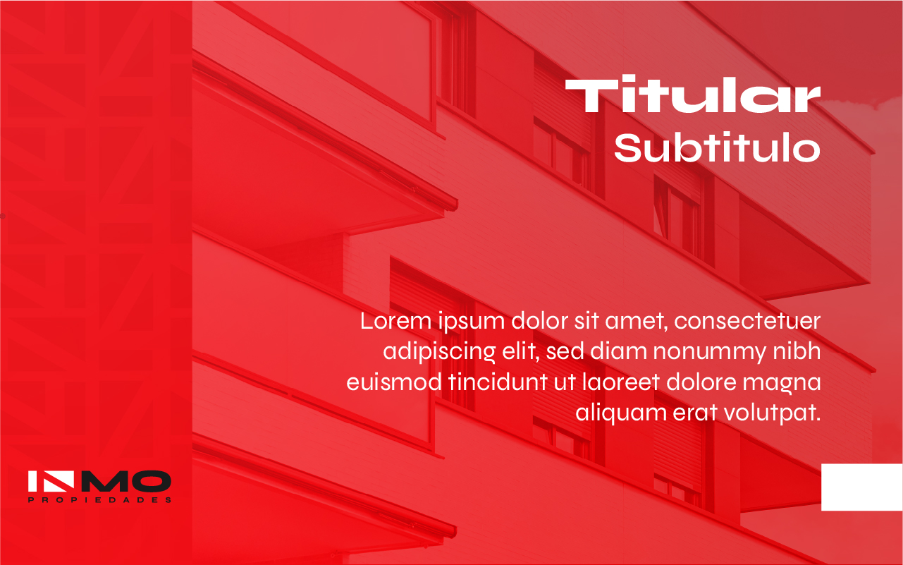
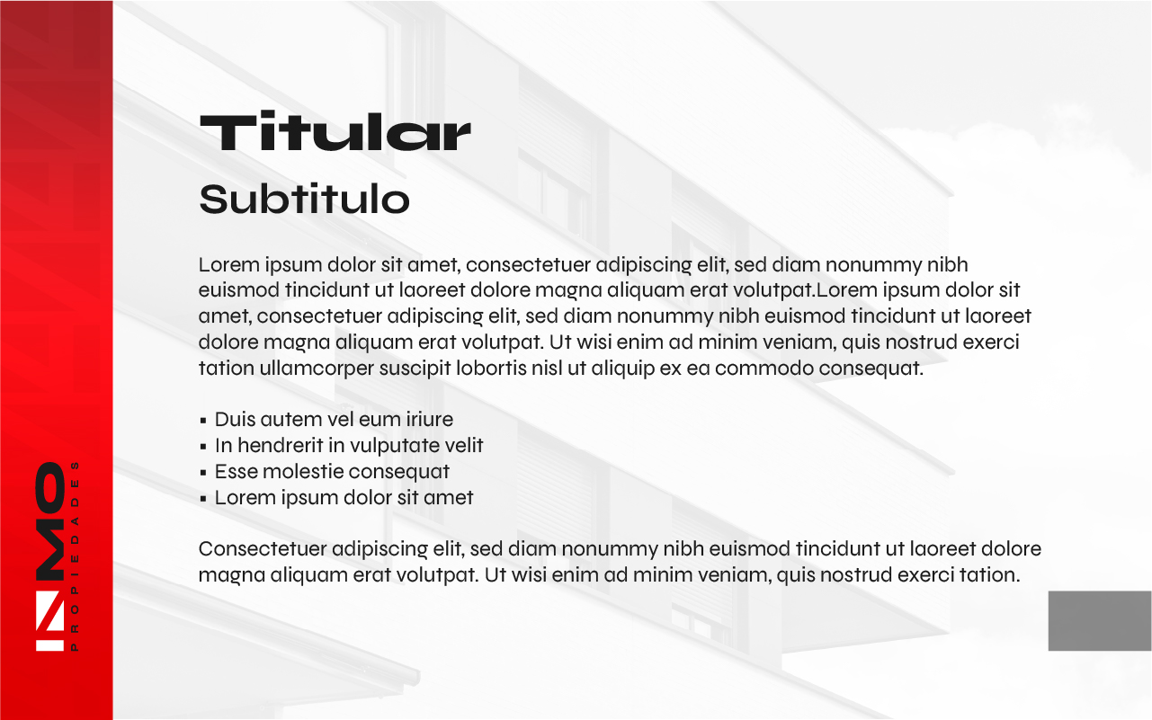
Context
INMO Properties is a real estate company with more than 25 years of experience in the Guatemalan and Central American market.
This project has a key distinction: it is not an isolated redesign.
The original logo was developed in 2011, and more recently a full brand system update was carried out to respond to a more digital, competitive, and visually demanding environment.
The challenge was not to start from scratch, but to evolve without losing recognition.
Brand evolution
INMO Properties is a brand with history.
Throughout its trajectory, its identity has gone through different stages, reflecting both business growth and market changes.
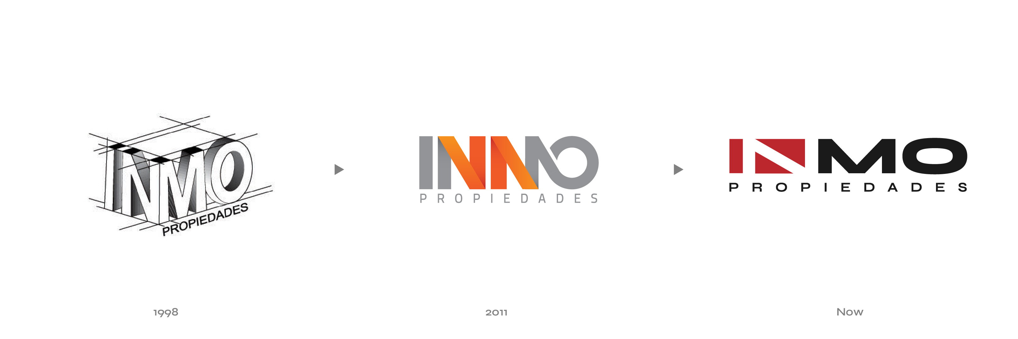
Stages
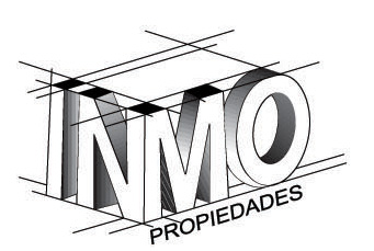
Conceptual stage Volumetric and structural exploration of the logo, focused on formal construction.
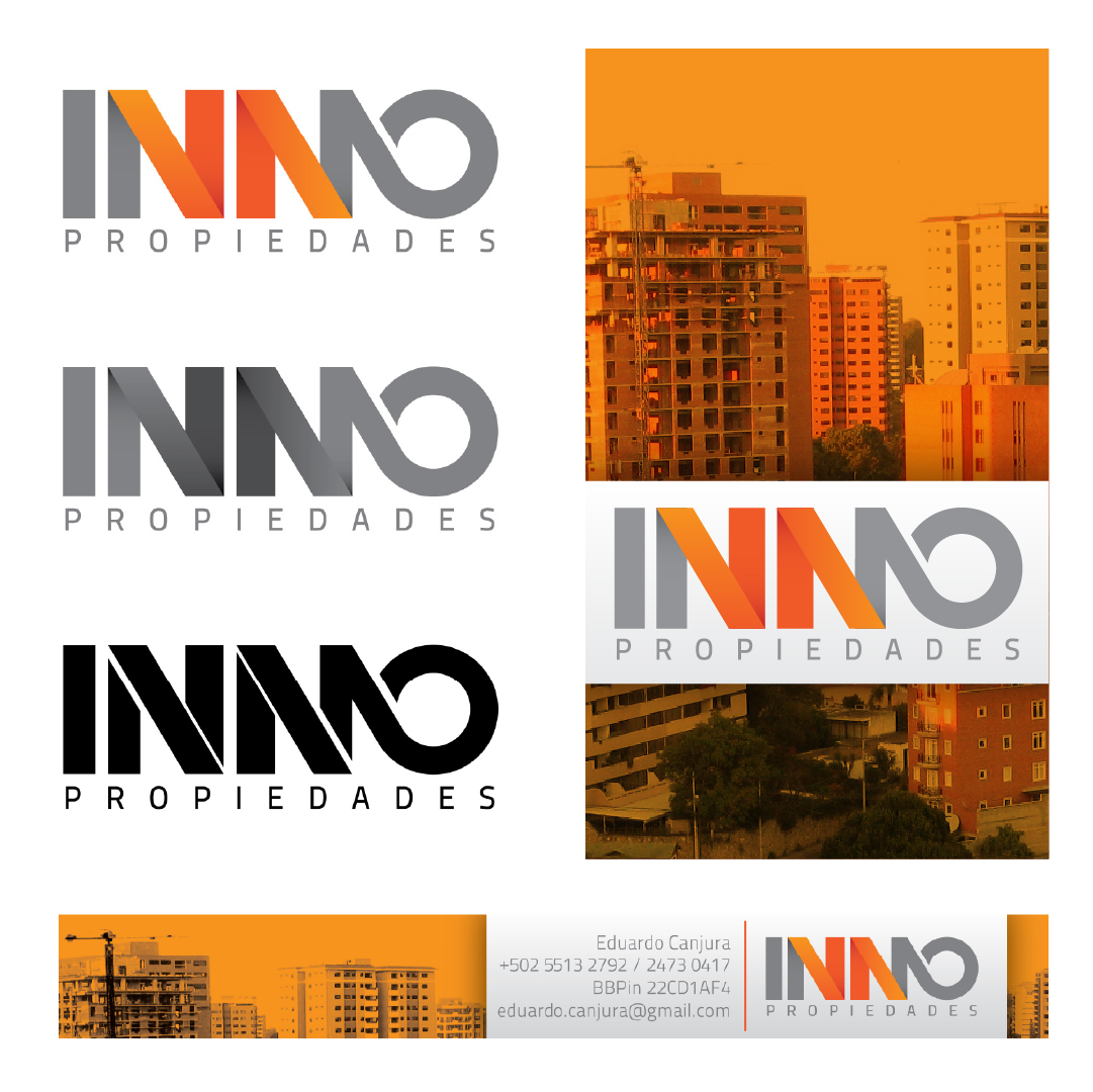
2011
First functional version of the logo, using gradients and a visual language aligned with its time.
Present
Refinement of the symbol and consolidation of a more solid, adaptable, and contemporary visual system.
Strategic decision
The goal was not to reinvent the brand.
It was to maintain continuity, reinforce recognition, and bring the identity to a more mature state.
Evolution is built on what already exists, not against it.
Problem
- Outdated visual identity compared to the current market.
- Lack of visual impact in digital channels.
- Inconsistent brand usage.
- Need to communicate professionalism, trust, and efficiency.
Objectives
- Update the logo while maintaining recognition.
- Build a coherent visual system.
- Position the brand against current competitors.
- Adapt the identity to digital and physical environments.
- Reinforce perception of trust and solidity.
Process
Analysis and continuity
The starting point was not a blank canvas.
The original symbol already contained a key element: the geometric construction of the “N”.
The decision was clear:
Evolve, not replace.
![]()
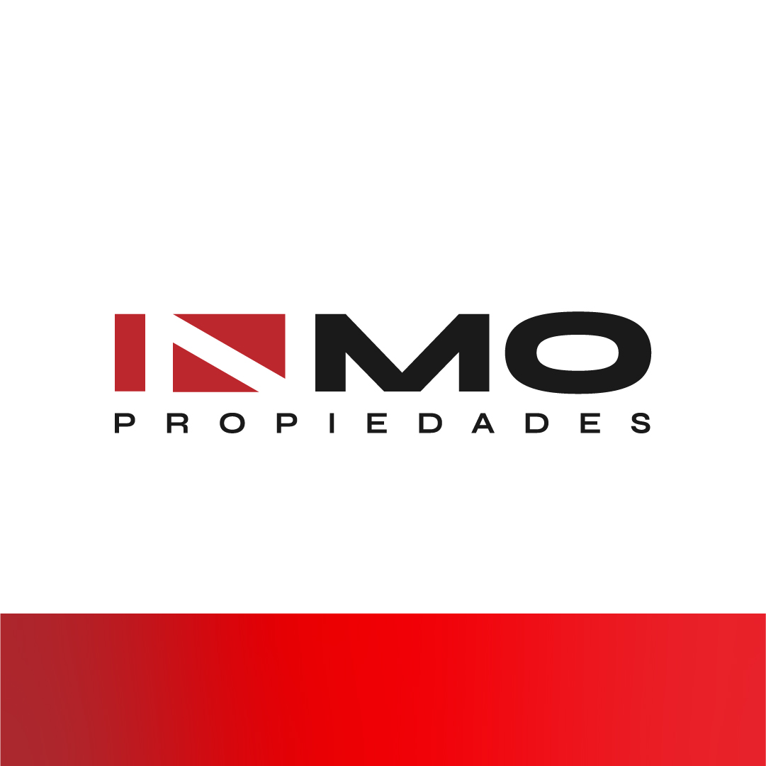
Logo redesign
The conceptual structure of the symbol was maintained while refining:
- Geometry
- Proportions
- Visual weight
- Legibility
The result is a more contemporary logo without losing identity.
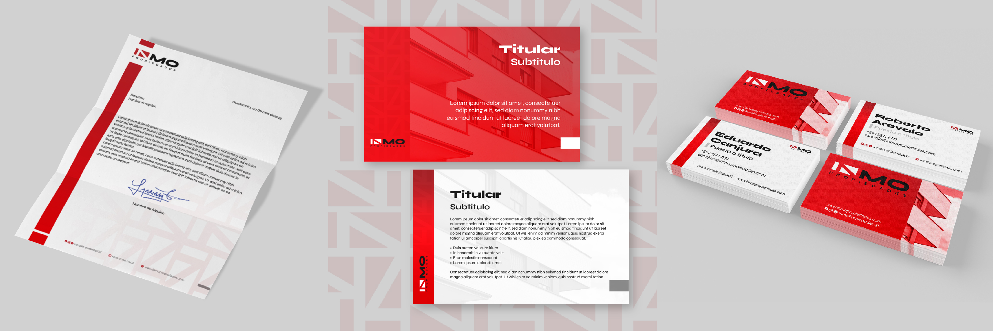
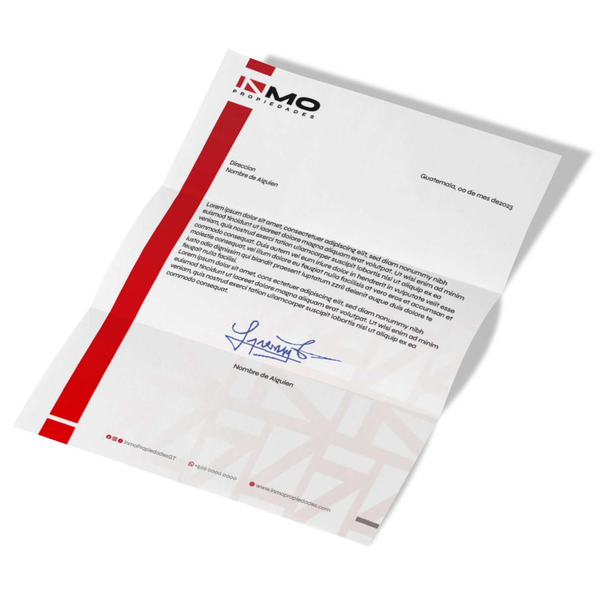
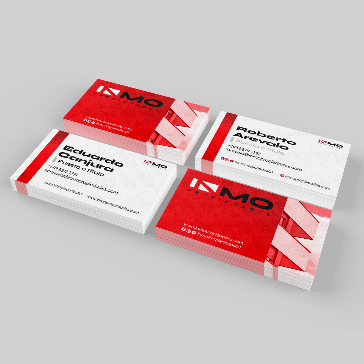
Visual system
From the logo, a complete system was built.
According to the brand guidelines, the following were defined:
- Color palette (red, black, white)
- Structured typography
- Modular pattern usage
- Consistent applications
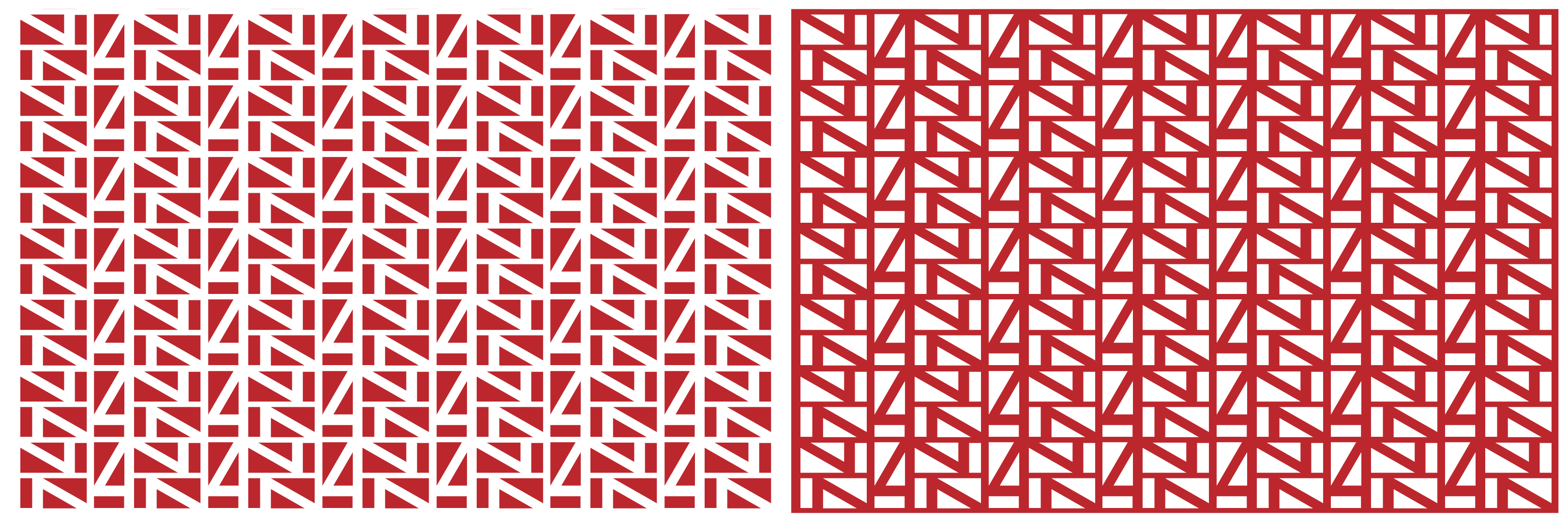
Graphic language
The pattern is derived directly from the symbol.
It enables:
- Identity beyond the logo
- Flexibility across pieces
- Visual consistency
Solution
Delivered:
- Logo redesign
- Complete visual identity system
- Brand guidelines
- Applications across stationery and commercial materials
- System adaptable to social media
- Brand manual
Results
- Brand continuity maintained over more than 25 years
- Visual evolution without loss of recognition
- Greater communication consistency
- System ready for digital growth
Reflection
Key learnings
- Rebranding is not starting from scratch
- Maintaining recognition can be more valuable than radical innovation
- A brand system is more important than a standalone logo
Professional reflection
This project represents a real evolution over time.
Designing in 2011 and redesigning more than a decade later provides insight into how a brand grows, changes, and needs to adapt.
INMO Properties is not a redesign.
It is the continuation of a decision brought to maturity.
Use case / future
The system allows:
- Scaling digital communication
- Generating social media content
- Expanding into new markets
- Maintaining long-term consistency