

Context
Observatorio ecoED aims to research, develop, and promote environmental, ecological, and regenerative pedagogies and practices centered on nature and communities through innovation and intentionality.
Process
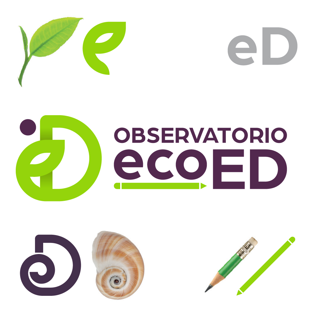
- The symbol combines three elements: a plant sprout, a snail (representing the golden ratio and slow but steady progress in education and research), and a pencil reinforcing the educational focus.
- These elements integrate to form the letters ED.
- The chosen color palette uses green as the main tone, supported by dark violet for contrast and readability.
Final solution
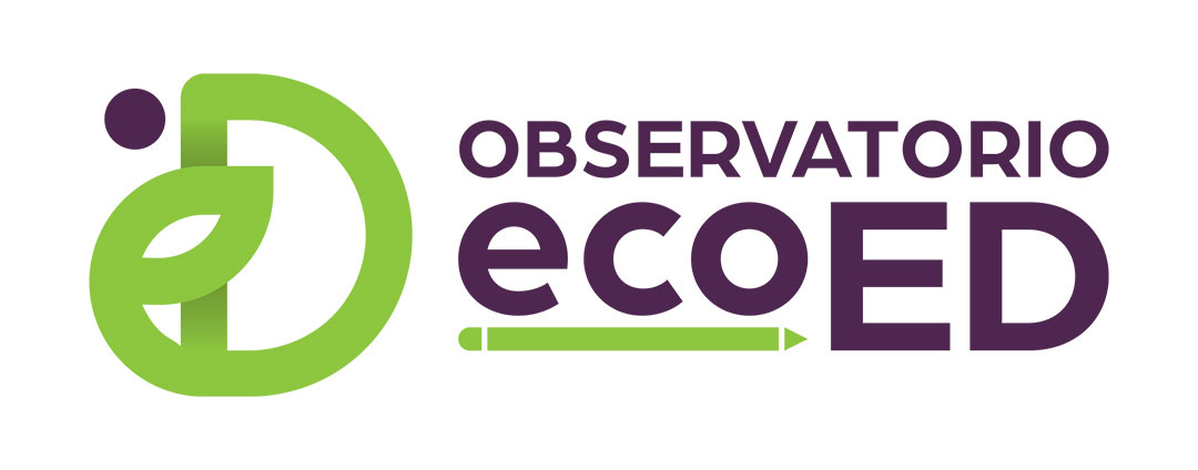
- Logo integrating ecological and educational symbolism into a simple, memorable design.
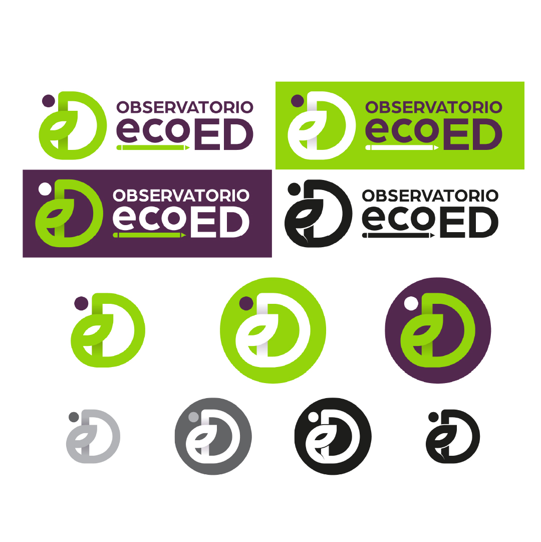
- Identity adaptable to multiple formats (digital, print, institutional).
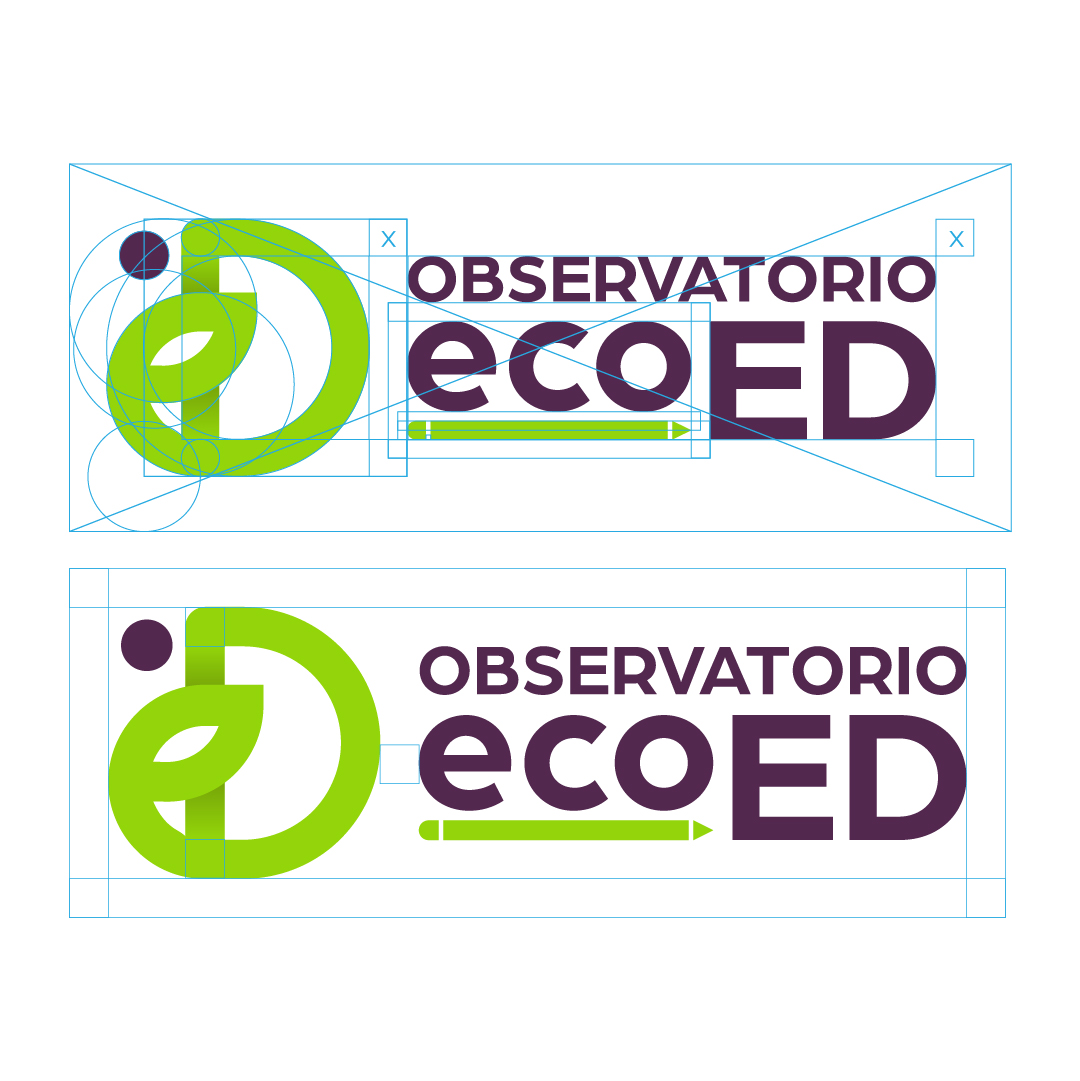
- Brand guidelines with rules for consistent use of color, typography, and applications.

Reflection
- Key to balance natural and educational symbolism within a single design.
- The combination of elements (plant, snail, pencil) successfully synthesizes ecoED’s mission.
- Challenge: keeping simplicity and readability at small sizes.
See more about this project on Behance: Logo for Observatorio ecoED