
Context
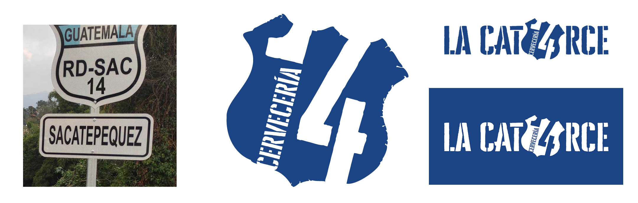
For some time, I wanted to work on a brewery project. This rebranding is a personal and independent exercise for Cervecería 14, with no formal connection to the brand. The goal was to redesign its identity while maintaining the shield elements tied to Route 14, and to give the logo and packaging a cleaner, more modern look.
Problem
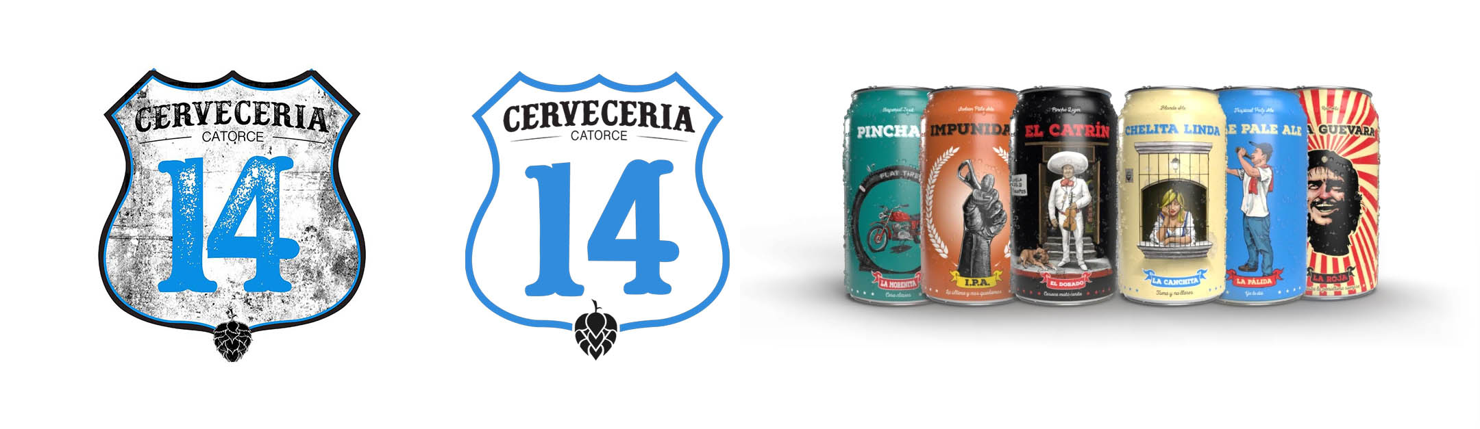
- The previous logo had too many details, making it complex and less modern.
- There was no consistency between logo, typography, and packaging.
- The branding did not clearly reflect the local identity or its historical connection with Route 14.
Process
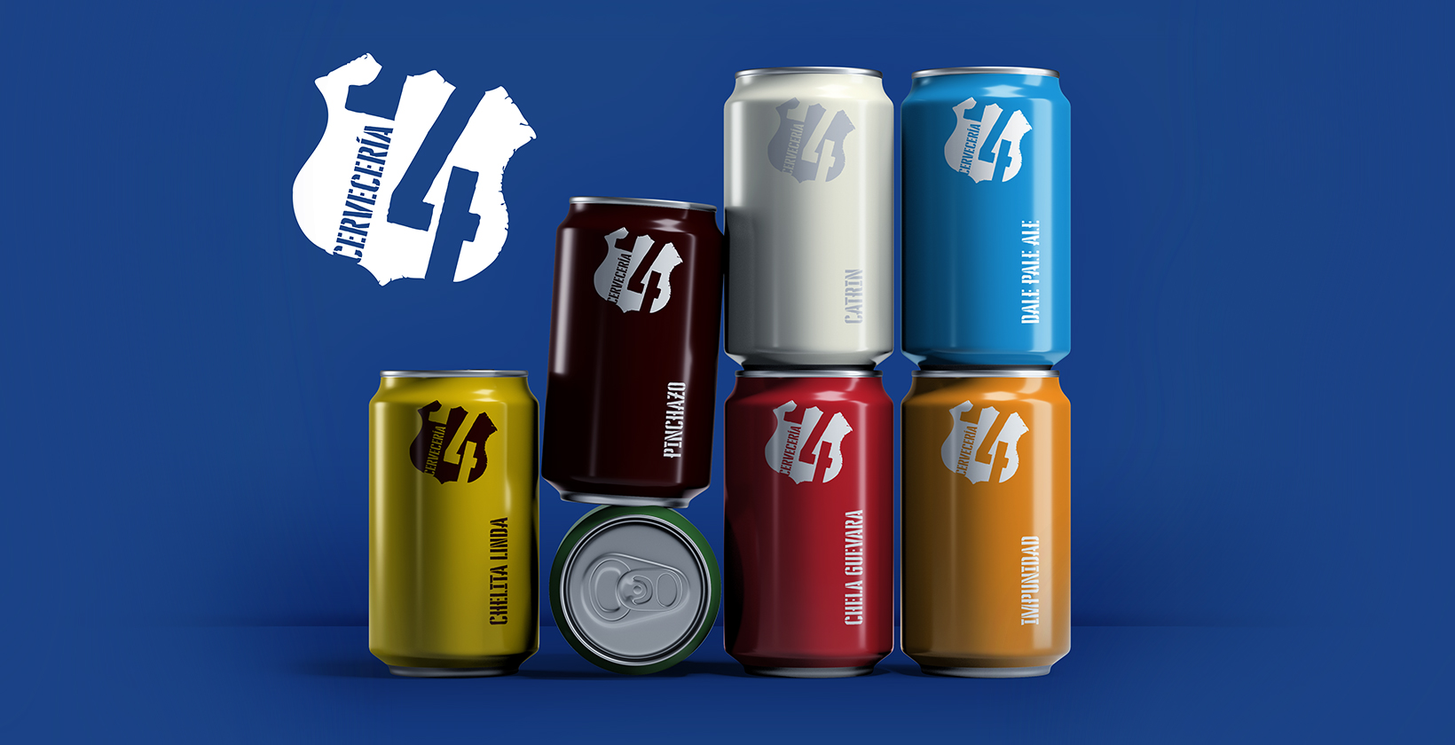
Logo simplification and refinement
- Simplification of the shield while preserving the traits representing local identity.
- New typographic treatment with stamped uses of the name.
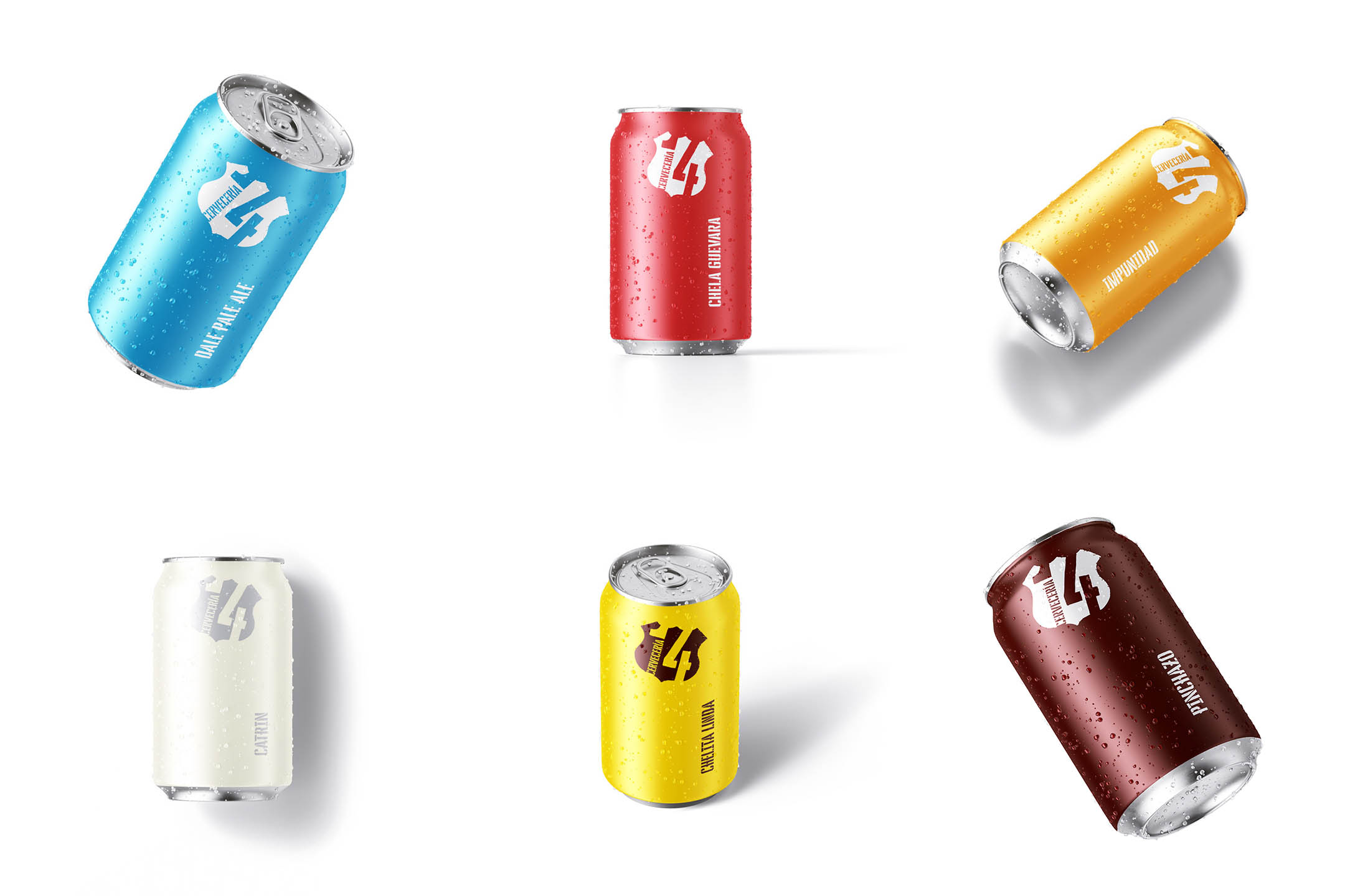
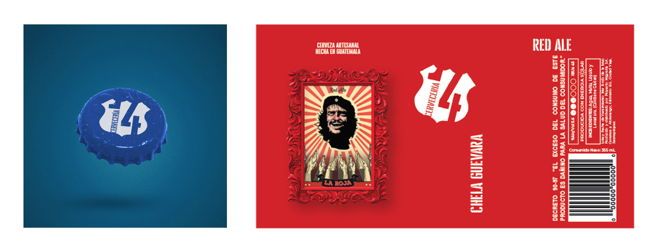
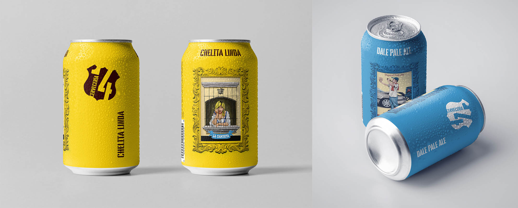
- Adaptation of the logo for different packaging formats: bottle labels, cans, and promotional materials.
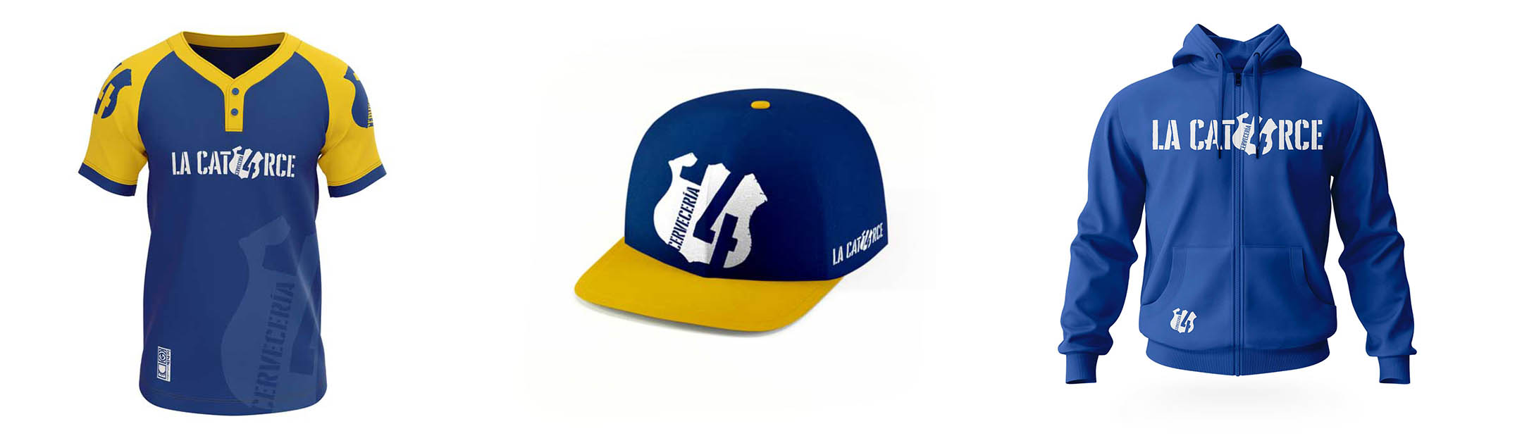
Packaging and visual applications
- Label design harmonizing with the new logo.
- Preserved visual elements from the original designer in label illustrations, respecting tradition.
- Use of a graphic pattern inspired by the region’s religious identity (already present in previous designs) for visual continuity.
Reflection
- A great exercise in balancing simplicity with historical and local meaning.
- I learned how small changes (simplification, typography redesign, color adjustment) can have a strong visual impact.
- Challenge: ensuring the new design keeps its personality in small formats without losing visibility on labels or promotional items.
See the full project on Behance: Rebranding for Cervecería 14