
Context
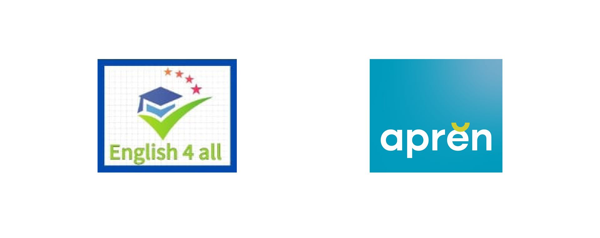
Aprĕn (formerly English 4 All) needed to evolve its identity to better reflect its values: accessible, fun, modern, and distinctive learning. The old brand no longer caught attention nor conveyed the vision of expanded services (tutoring, refresher courses, languages).
Problem
- The existing brand lacked visual impact and memorable presence.
- The name and identity did not reflect the academy’s growth or its new offerings.
- In a saturated market, there was little differentiation from competitors.
Process
Brand research & strategy
- Analysis of prior positioning and perception among potential students.
- Study of alternative names: exploring words based on learn and its linguistic heritage (e.g., “lernen”).
- Stakeholder sessions to understand aspirations and the brand’s essence.
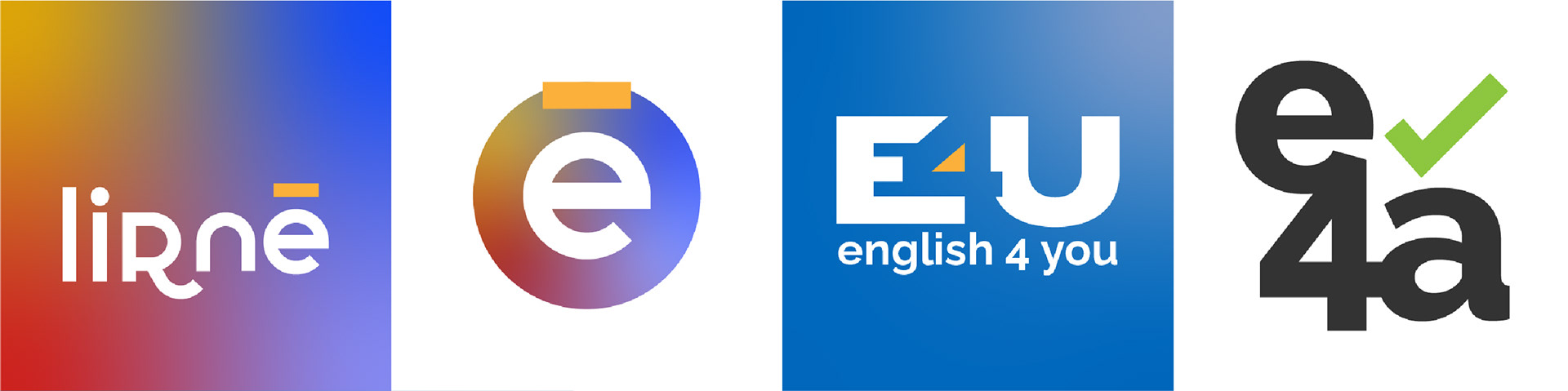
Naming
- Several options were explored: keeping the original name, adapting “learn” and derivatives, until reaching “aprĕn”.
- The chosen name leaves the word unfinished (“aprĕn”), provoking the viewer to mentally complete it, creating a psychological connection.
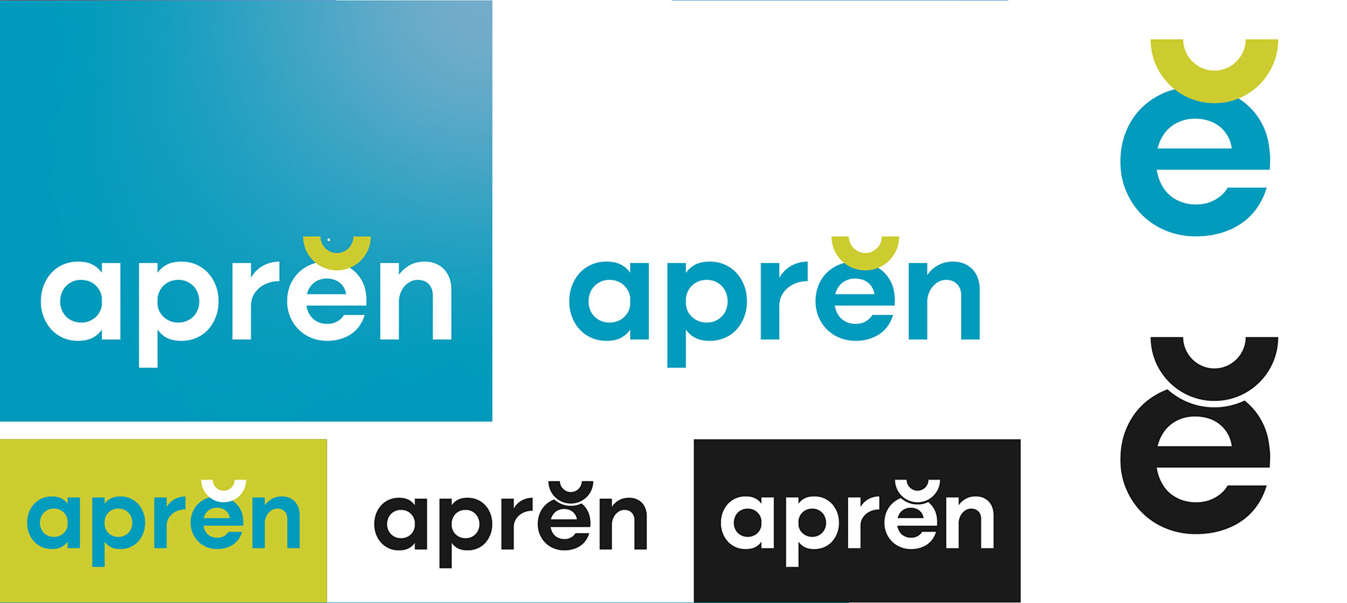
- The breve accent was used as a distinctive visual sign, an anomaly that brings aesthetic tension.
Visual Identity
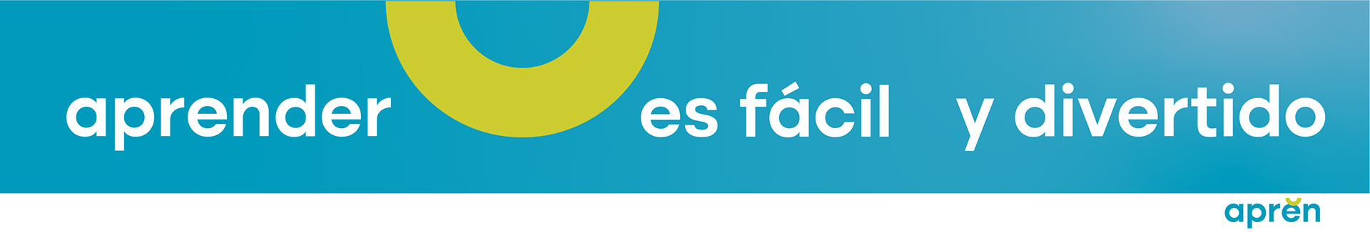
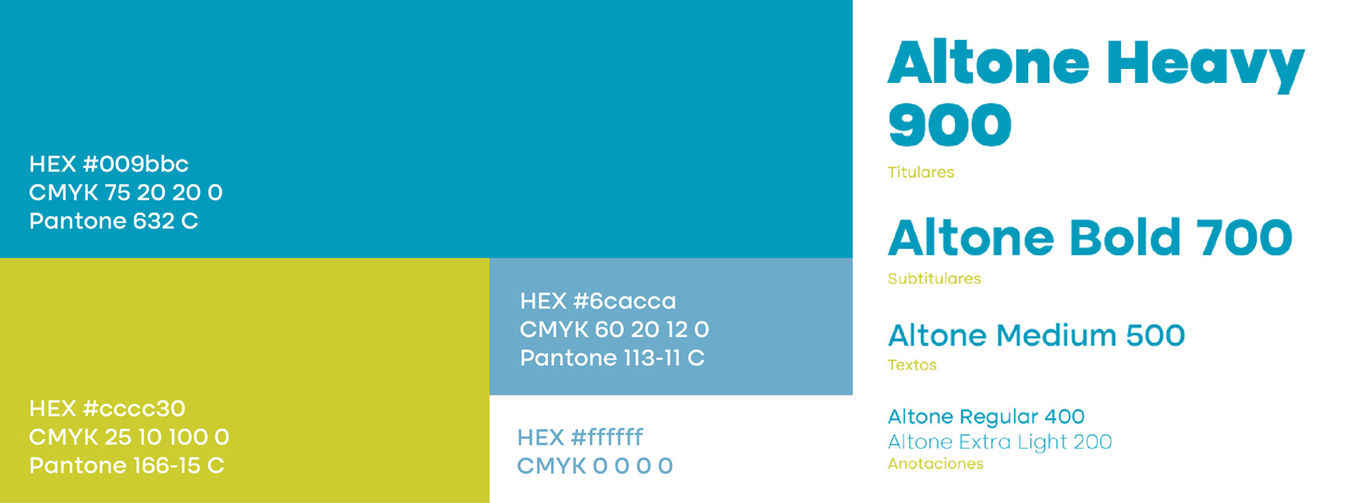
- Color palette: bright green and cyan as primary colors to convey freshness, modernity, and dynamism.
- Modern, clear, and accessible typography.
- Logotype with the breve (“ĕ”) as a unique brand feature.
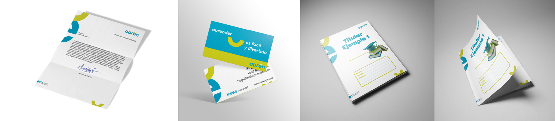
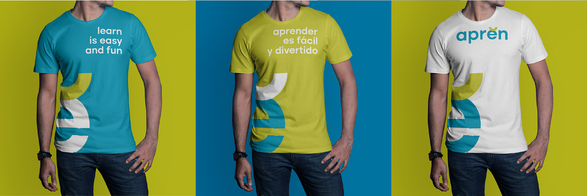
- Applications across different media: stationery, digital, social networks, promotional material.
Solution presentation
- Name: aprĕn
- Full identity: logo, color system, variations, iconography.
- Brand manual and style guide (logo usage, typography, color, spacing).
Reflection
Key learnings:
- Creating a visually memorable name requires risk and differentiation.
- Details (like the breve accent) can serve as strong identifiers without overwhelming.
- Alignment of visuals with strategy and brand values is crucial from the start.
Project reflections:
- The unfinished name (“aprĕn”) generates curiosity and engagement.
- Care is needed to maintain legibility and versatility across formats.
Use case / future:
The identity can adapt to future expansions: bilingual versions, digital products, educational apps, merchandising.
See the full presentation and mockups on Behance: Re-brand for aprĕn